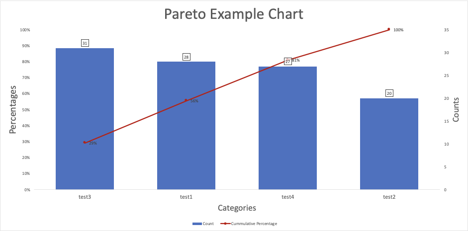
A Pareto chart is a type of bar graph that helps identify the most important factors in a set of data. It shows categories in descending order of frequency or impact, with a line graph that displays the cumulative percentage. This makes it easy to see which issues or causes you may want to prioritize for improvement – based on the idea that a small number of causes often account for most of the effect (the 80/20 rule).
Template Preview
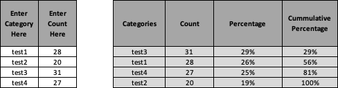
Below is an image of an example of a Pareto Chart. The first image shows an example grid; select the arrow to swipe to the Pareto Chart that is returned from this example.
 Example: Pareto Grid
-
Example: Pareto Chart
Instructions
Instructions can be found on the first page of the template and briefly outlined below:
- Start in A2 and B2, then A3 and B3: Enter at least two category names and their counts.
- Continue entering data in Columns A and B: Add more categories as needed.
- Customize Labels (Optional): Use cells L2–L5 to personalize chart titles and axis labels.
- View Results: The chart and supporting calculations will update automatically.